

Project 2: Typeface Poster
The goal of this project is to learn the history of a typeface and how to incorporate the history and the unique characteristics of the fonts into a design poster.
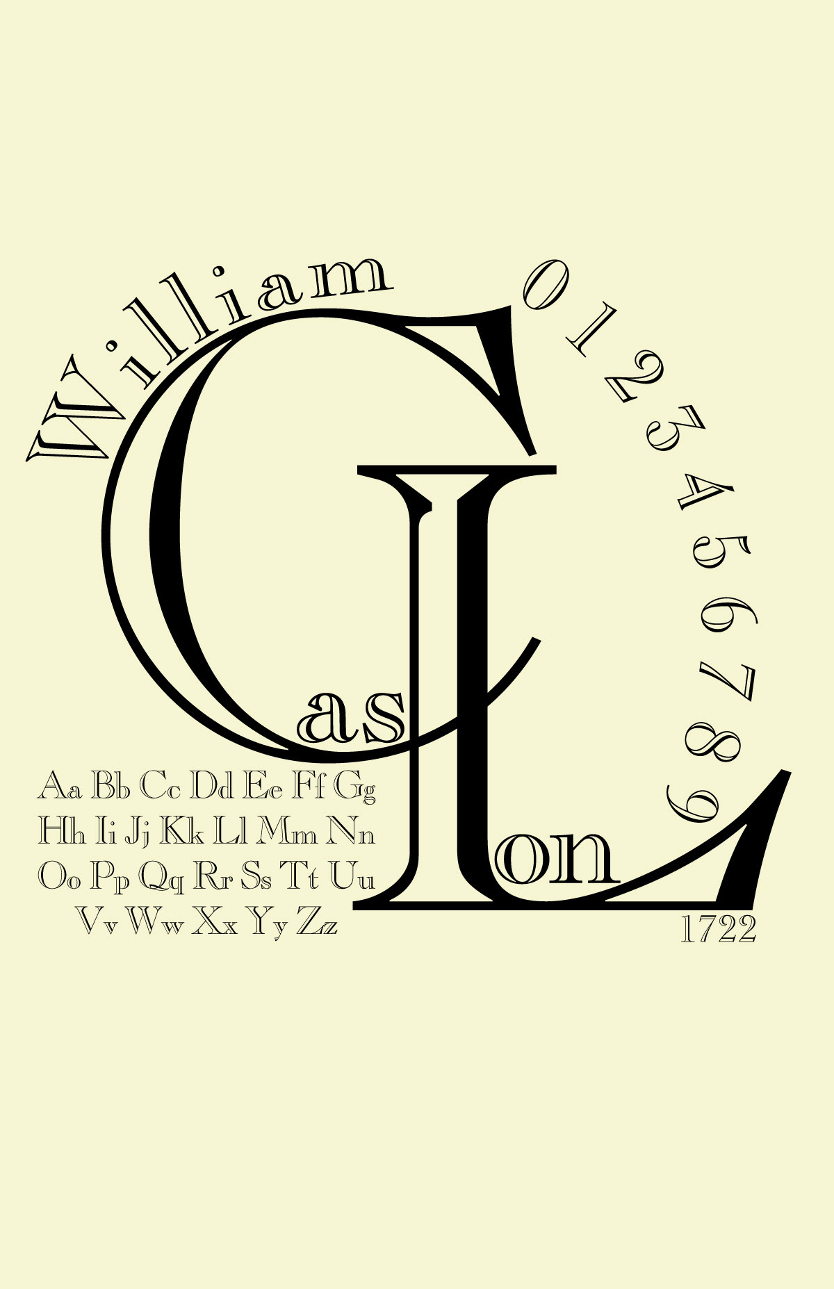
For this project, I chose the Caslon typeface which was created by William Caslon in 1722. Before Caslon was created, italicized typefaces were much preferred to save space and add as much information as possible. William wanted to create a typeface that is legible for the audience and it was first created by punch cutting. Caslon was quickly favored and widely used throughout the 18th century in books and newspapers. Caslon established the first printing industry in England and it established the English national typographic style. Now, the font is used for books and also body text because of its neatness and legibility which coined the phrase, "When in doubt, use Caslon".
I wanted to create a design that fits the 18th-century theme while also making it simple and clear for all the fonts and texts to be readable and stand out. However, that created a challenge where there was very little to work with how I wanted to play around with the typeface and the format of the design. I couldn't make it too abstract since that would lose the 18th-century theme and it was difficult to not make it look simple and plain.
Design 1: I personally like this design a lot however, it was too abstract and it was difficult for people, who may not know a lot of typeface, to recognize what the name of the typeface is.
Font: Caslon Open Face
Font: Caslon Open Face

Design 2: This is the design I chose for the project. The layout of the fonts and texts was readable and the different styles of the typeface (open face style and letter standard) helped make the design stand more.
Font: Caslon Open Face & Caslon 3 LT Std (Roman and italic)

Design 3: I also like this poster design however, it was too abstract to fit the 18th-century theme and it looked very clustered on the left side of the design.
Font: Caslon Open Face

Design 4: I was considering choosing this design as my final design for Project 2. It was well-uniformed and the hierarchy in this composition was well-placed. However, this design lacks the fun composition and layout of the different fonts as opposed to the second design.
Font: Caslon Open Face, Caslon 540 LT Std, & Caslon 3 LT Std (italic)

